
Stay Informed
Sign Up for the TBL Newsletter Today!
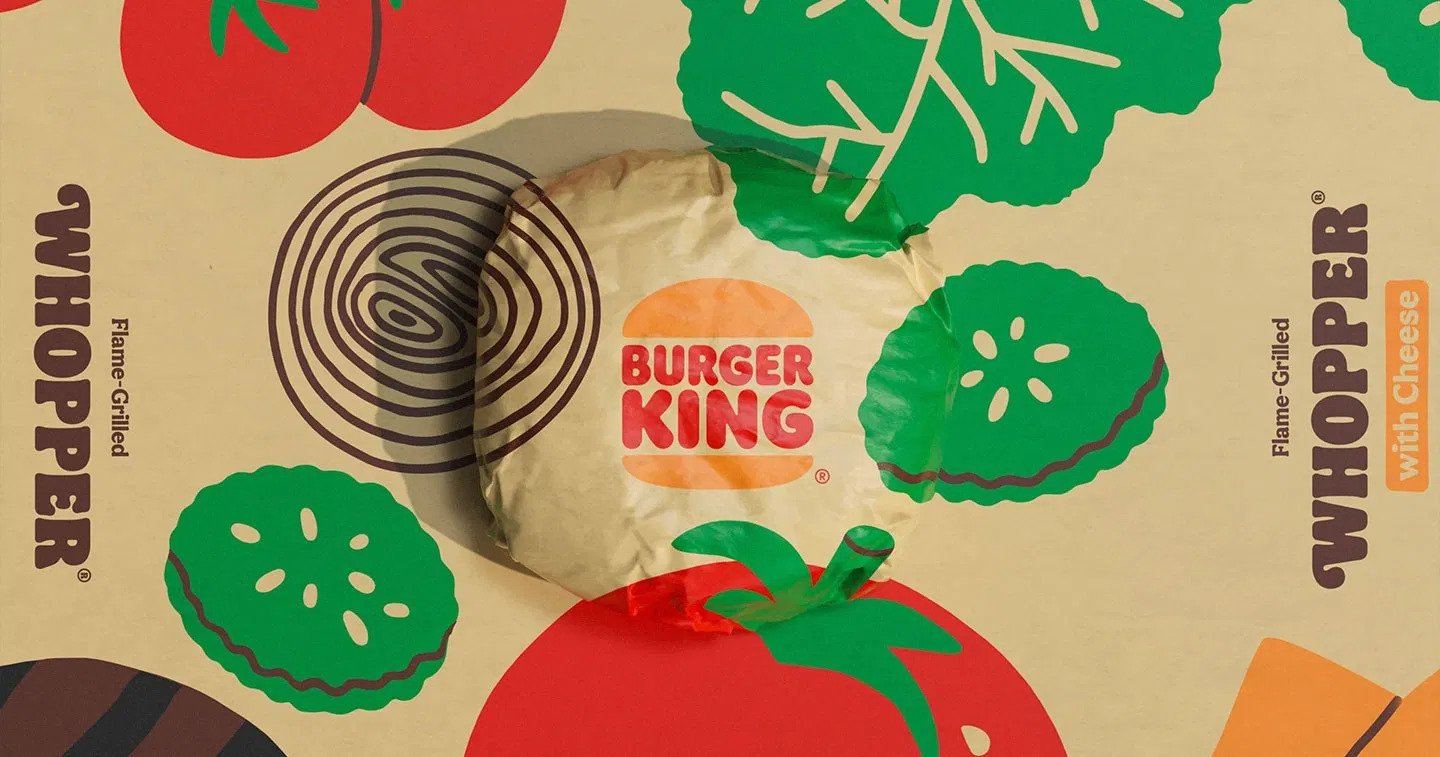
[formidable id=3]Designed by the agency Jones Knowles Ritchie, the super-flat design effects incorporate a number of different features — from the custom font Flame, which hearkens back to the Cooper Black of the late 20th century, to the earthy color palette that many of us grew up with. The effect is retro without being dated; fun without being silly; and personable without being obnoxious.
Why the Rebrand?
According to Lisa Smith, executive creative director at Jones Knowles Ritchie, there were a few reasons for the Burger King rebrand—not least of which was functionality. In fact, many brands undergoing redesigns will do so in order to make their logos and designs more digital-friendly, and as such, flat design is the big trend.
There is another reason for the company rebrand, however — to emphasize freshness in a time where fast food is losing traction in favor of healthier alternatives. As Smith told Fast Company, “We wanted to use design to close the gap between the negative perceptions people have of fast food and the positive reality of our food story by making the brand feel less synthetic, artificial, and cheap, and more real, crave-able, and tasty.”
For a few more points of view, we took the Burger King rebrand and put it to our creative team for their insight. Here’s what they told us.

Kyle Duford, ECD
Burger King — along with Pepsi — has long been ok with “being number two,” but that only means being able to punch above their weight and try things that a challenger brand can do. With a smaller ad budget compared to behemoth McDonald’s (Mickey D’s has a 19% market share compared to Burger King’s 5%, according to Nasdaq), they have to make their ads, presences, and brand last longer and make more of an impact than that of the leader. This rebrand is a bold new step to change its image to that of a timeless classic, as opposed to a burgeoning new fad. With a ‘90s retro look, and some funky, curved typography reminiscent of the 1960s, the new aesthetic is both unexpected and yet, familiar.
Chris Heuvel, Creative Director
When you look at the new BK rebrand, you can't help but smile. The new look is bold, exciting and refreshing, and they've expertly used colors, typography and illustrations to evoke positive emotions and create a distinct, authentic look.
But authenticity doesn’t stop there. The old logo had a plastic, artificial look, but not anymore! The new logo—while based on the logo from the ‘60s—feels real and natural. They even modified the proportion of the bun to the burger in the logo so it truly looked more like the actual products.

Even their colors used were modified to look more like their actual food, ingredients and the brand's flame-grilling process — and to a finer degree, the names of the colors are branded, as well: Fiery Red, Flaming Orange, BBQ Brown, Mayo Egg White, Melty Yellow and Crunchy Green
In photography, the shots of the food are taken at a macro level to highlight, not hide, every detail of the food and it's quality — a direct reversal from the standard food photography practice. You can almost smell the flame grilled patty when you look at the image. Finally, The loose style of the hand-drawn illustrations are expressive, artistic and uniquely different from the style of McDonalds, Wendy's, Arby's and the other fast food guys.
Overall, my favorite part of the rebrand is the secondary mark they created. It's expertly crafted to represent the main logo, while cleverly displaying the letters B and K with the mark. Simple, memorable, powerful. That's great attention to detail, even the smallest elements of the brand.

As you can see, the reasoning behind every design decision was carefully thought through. Every element was chosen to represent the commitment to digital-first thinking, improvements in food quality and environmental sustainability.
The best part is that the rebrand doesn't merely display brand new visuals, it uses those visuals to tell a story about what Burger King stands for. They want guests to feel good about their food.
Zach Halleck, Digital Art Director
I agree with the overall direction in that the brand needed an update. The logo itself is nice and strong, and I can see how it will work well across many mediums. The colors also work well — while it is a more subdued color palette, it also still has some punch to it, and ties back to a retro vibe that works with the idea that the brand has been around for awhile. The typography — both in the logo and the typeface that was created — strikes a good balance between bold and strong, but is also a little quirky, similar to how the Burger King brand’s voice and tone has evolved over the years. In my opinion, the new mark definitely is headed in the right direction in order to stay up-to-date with the ever evolving digital era and the personality of the brand.

Lauren Skrade, Associate Art Director
Burger King’s updated logo is simultaneously nostalgic and new. The logo refresh is guaranteed to cause the majority of Burger King’s audience to reminisce about their childhood as a version of the familiar logo was used from 1969 to 1999. Sentimental value is a powerful thing to have with any brand, and is especially helpful with redeeming an outdated and poorly-aged identity. Everything about this new look is bold, yet approachable; retro, but fresh; and clean, yet full of groovy personality.
Karl Tremper, Production Designer
Burger King has slowly been transforming from a shiny, corporate machine to a fun, unpredictable and authentic brand. Few fast food brands are able to make this metamorphosis as effectively and creatively as Burger King. Through a series of top-notch marketing campaigns and a calculated switch in brand tone, Burger King has been steadily transforming their identity over the past few years.
Many companies view rebrands as a change in direction for a company, but this rebrand was not a fork in the road for Burger King. True rebrands start with company culture and customer perception, leaving the change in visual identity as the last step to solidify and certify the company’s new Identity, and many other rebrands (like Petco and The GAP) startle and confuse their customers through rebrands that seem unearned. Burger King, however, has been paving the way for this rebrand through many years of hard work and on-point brand messaging.
While fun to deconstruct, rebrands can be overwhelming if it’s your company looking at one. Fortunately, we can help. If you’re looking to overhaul, upgrade or simply change direction with your company or brand, start with a quick, free download of our Ultimate Guide to Rebranding for tips on how to best move forward.


