Megmeister: A Case Study

Share

Performance at the Core

Client

Megmeister

Completed

September 2022

Website

Megmeister.com

Brandwork

Ongoing

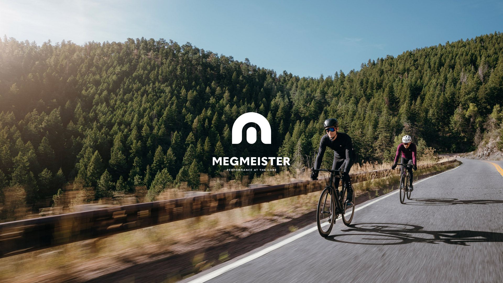
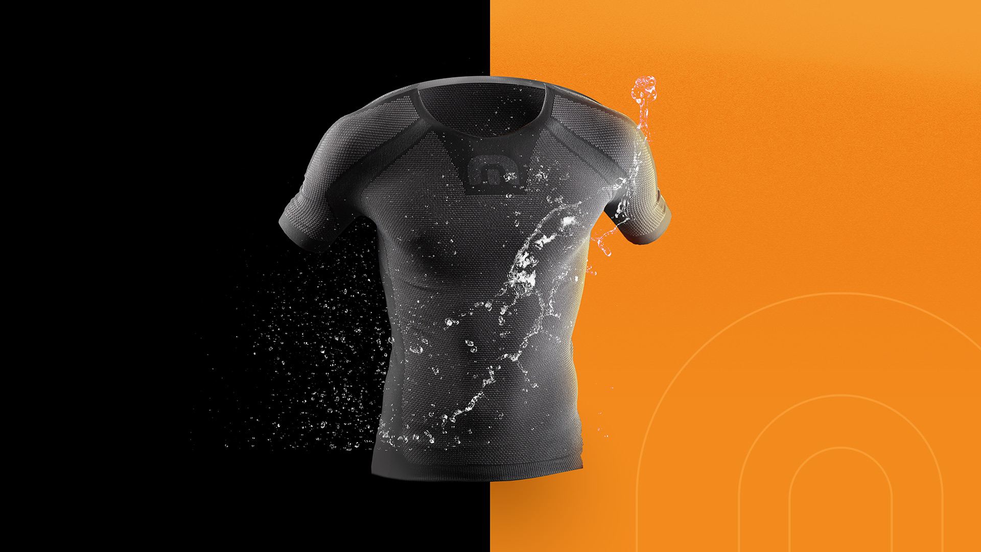
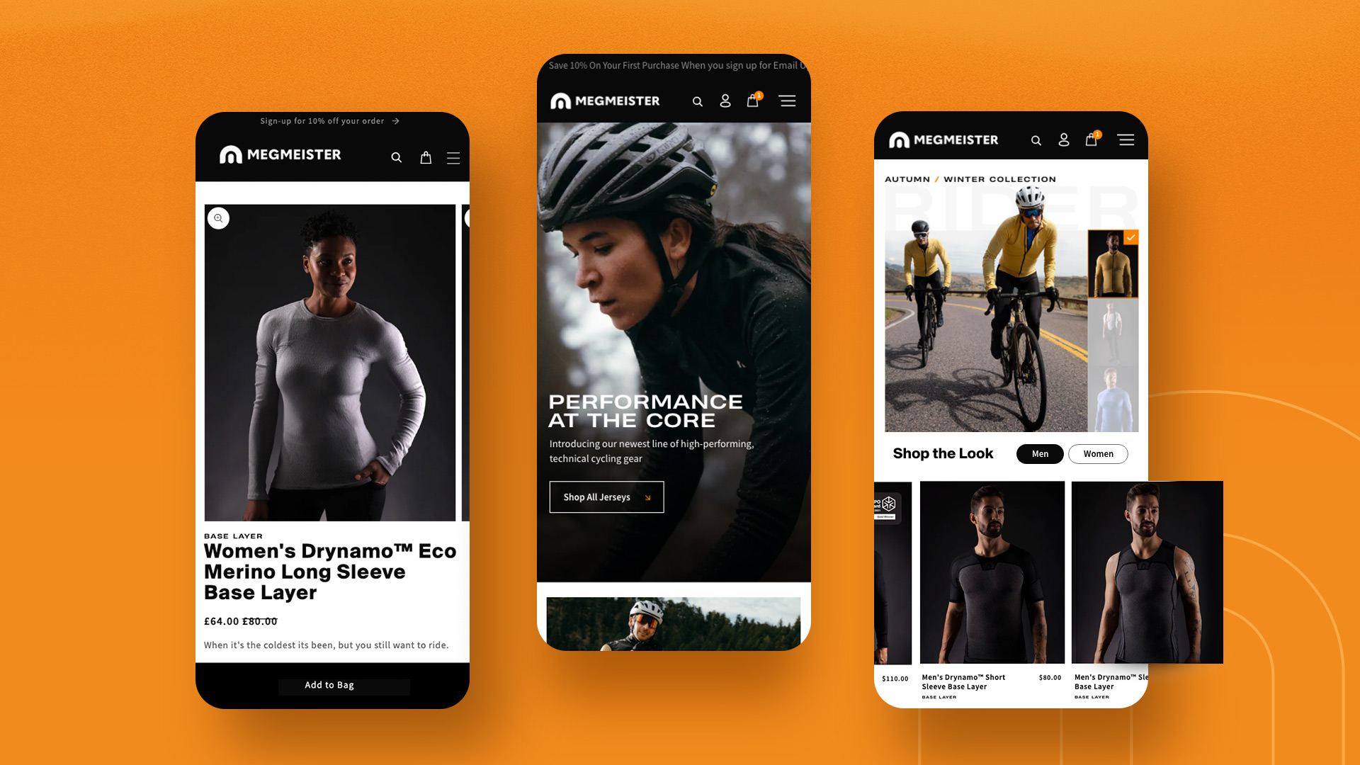
When British/Dutch cycling brand Megmeister came calling, we quickly jumped at the opportunity to work with them. Renowned for their use of innovative fibers for their products, which are made from the world’s most advanced technical yarns, Megmeister’s Drynamo is the secret behind their game-changing base layers that lead the field in quality, comfort, and performance.

Our Services

Rebranding
Visual Identity
Packaging
Web Design
Photography
Videos
Digital Marketing
Social Media
Ad Campaigns

Award #1

2022 NYX Grand Winner - Photogrpahy

Award #2

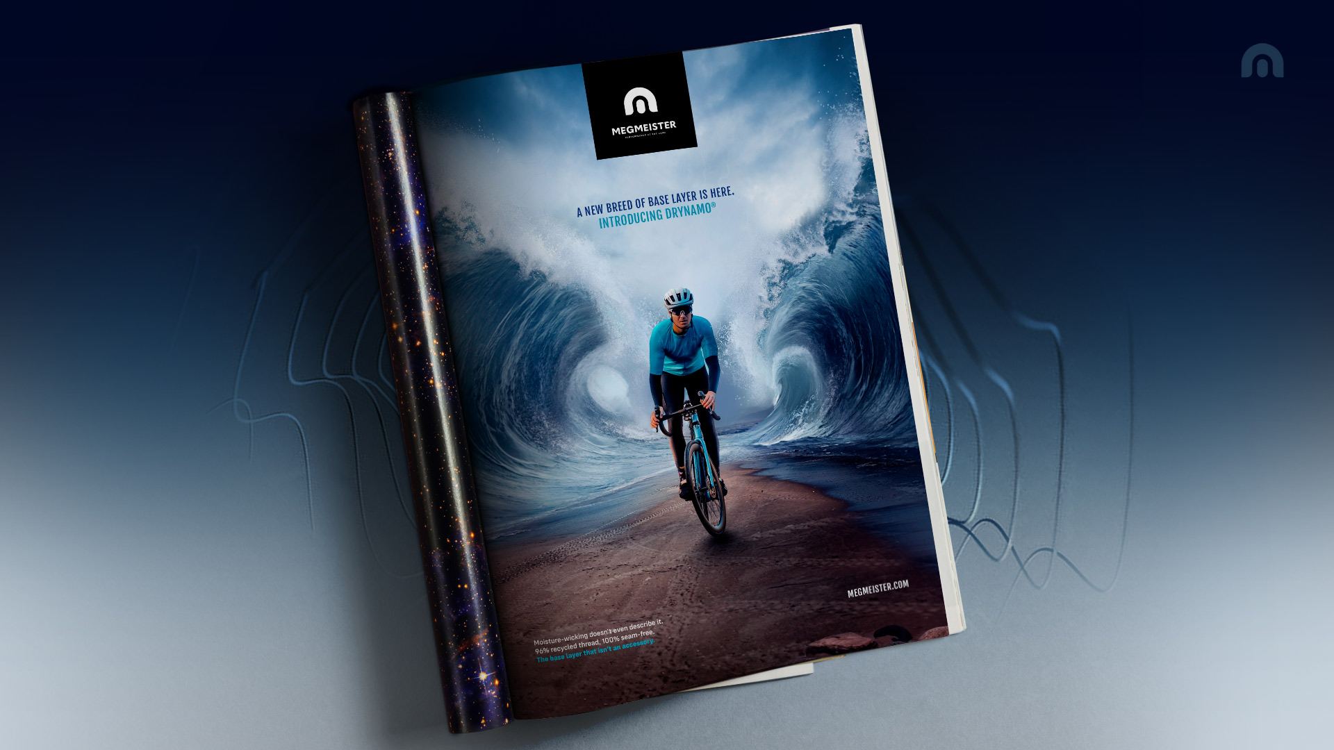
2022 NYX Grand Winner - Campaign (Single Ad)

The Challenge

Building a brand with a unique position in the new US market that creates a meaningful connection with consumers in a saturated cycling apparel industry

Understanding the Problem

How do you take the storied sport of cycling and not only introduce new products to its athletes but new materials as well? That’s what Megmeister was asking themselves when they contacted The Brand Leader. Their newest, quickest-wicking product on the market, Drynamo™, was now in their base layers and other cycling apparel. There was just one problem: no one knew who they were, especially in the United States.

The brand had gained momentum and a following in Europe, mainly through their licensing of the material for a co-lab with Adidas for their TERREX line of base layers, which ended up winning the prestigious ISPO Gold Award in 2021.

But how do they enter the US, especially in the overcrowded cycling apparel market?

We were amazed at the level of excellence the team provided. From the packaging to the photos, the website to the designs — it was first class all the way.

Vanessa Ruiterman

The Solution

Create a “Magician” archetype brand that focused on the innovation and technology behind their premium cycling apparel

Creating Magic

The brand needed to stand apart from the plethora of other cycling apparel companies on the market. To do that, we first needed to understand who they were. We started with an in-depth brand discovery process that allowed us to identify a gap in the market for a Magician archetype — one they could authentically own with their “How’d they do that?” product line.

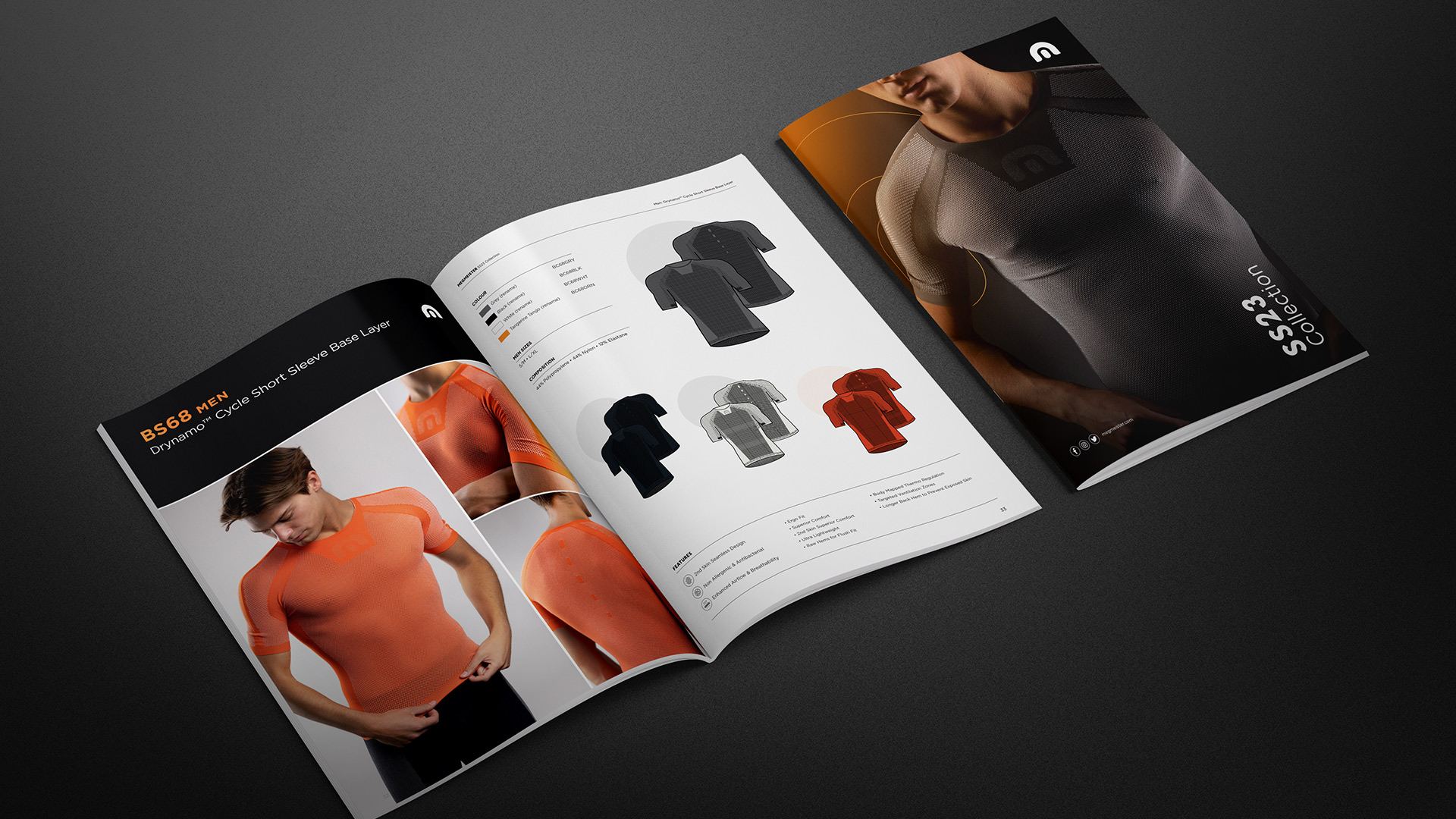
From there, it was full gas. Colors, logo tweaks, typography — everything was driven from that new point of view. We validated the brand positioning against their previous European performance and their contemporaries in the United States. The voice and tone were born from this new perspective as well: How does a magician act, show their work, develop new products, and ultimately speak to their customers?

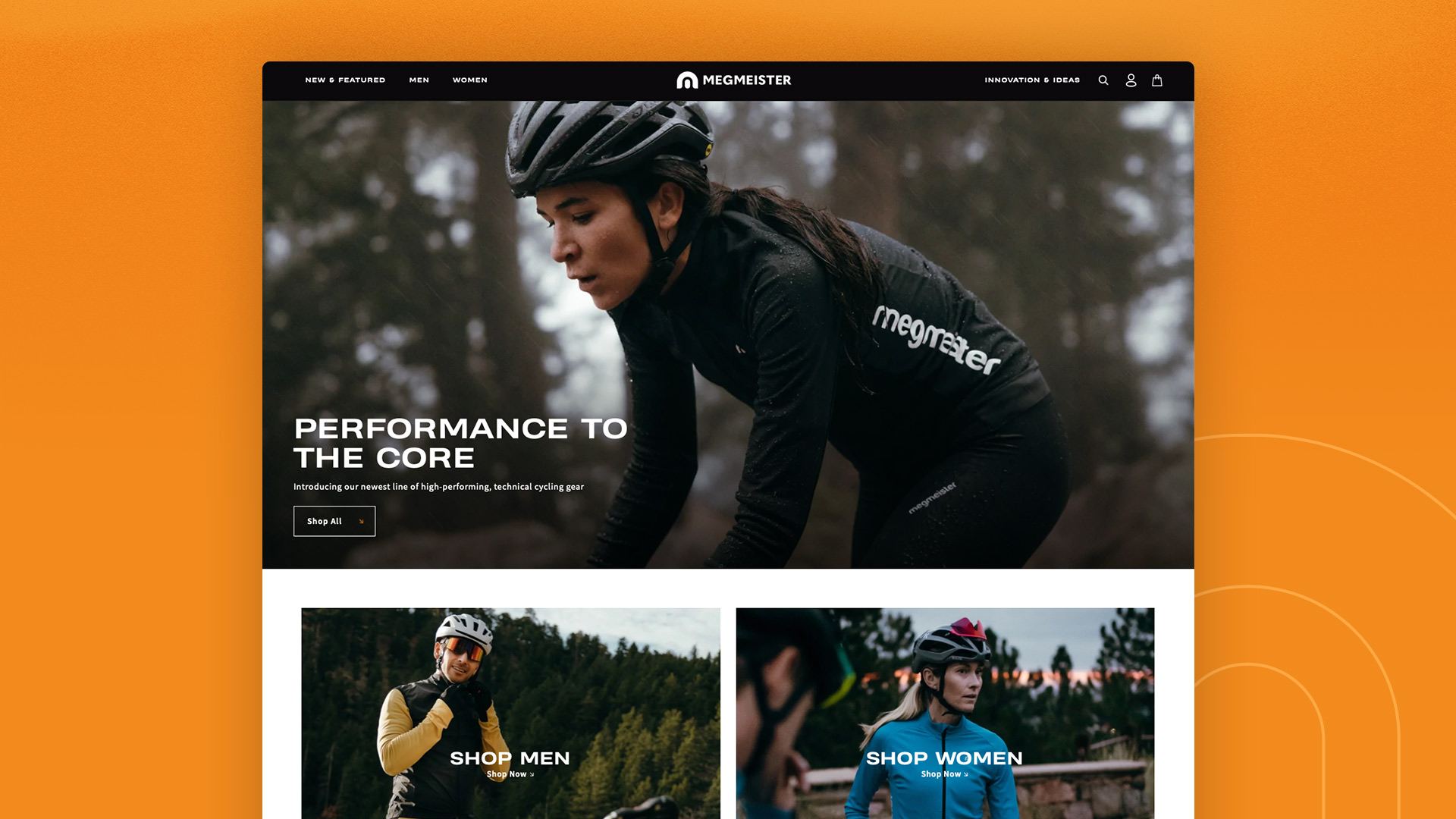
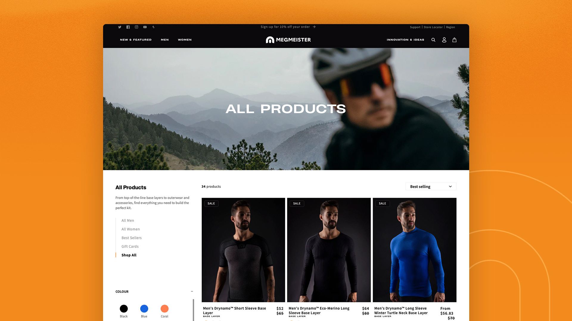
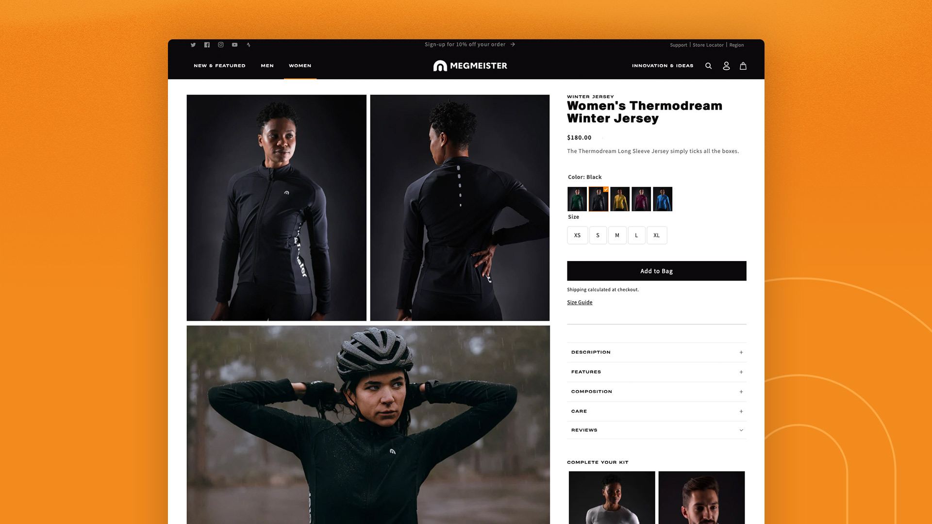
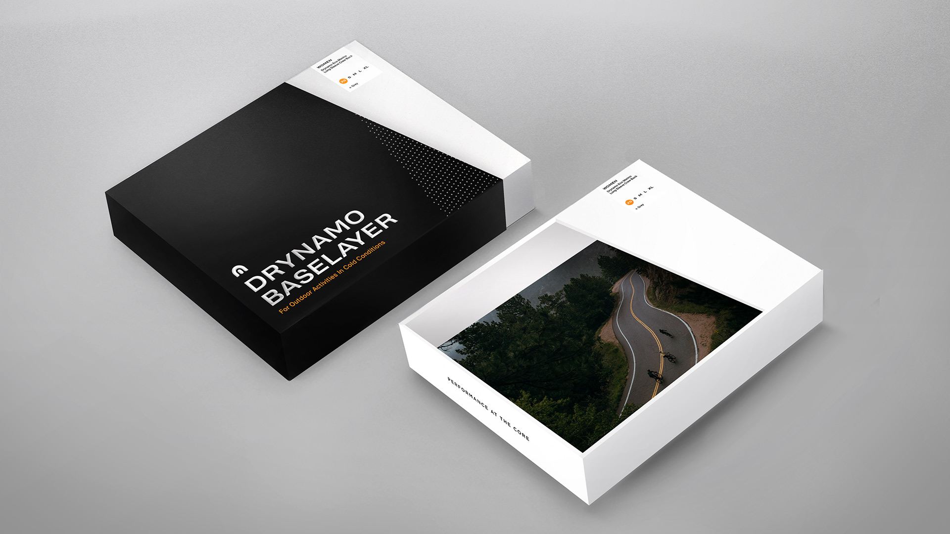
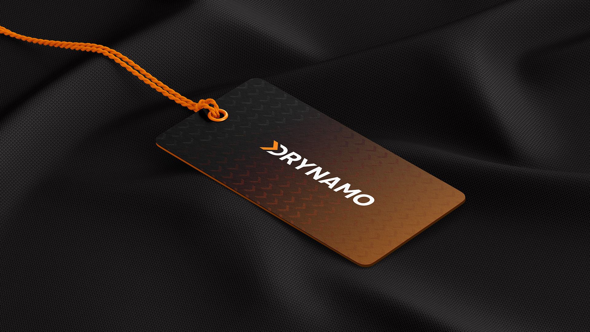
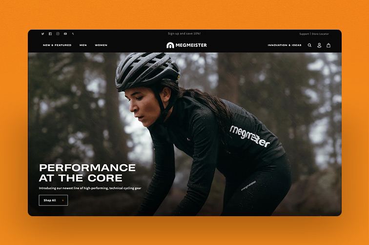
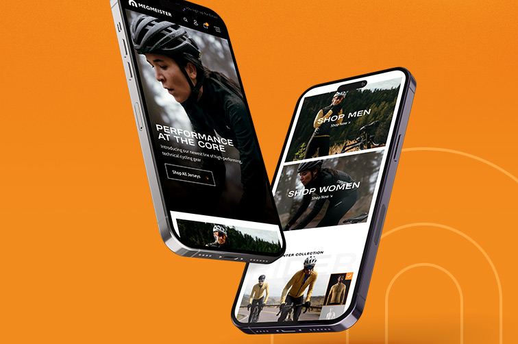
The TBL team then crafted the Drynamo logo and numerous packaging options for Megmeister before embarking on some weeks-long photoshoots and the design of the new Shopify website.

Results

  • 408%

    Increase YOY in US Visitors to the website

  • 114%

    Increase YOY in overall global transactions

  • 128%

    Increase YOY in overall global revenue

Proven Results

The results were as expected: a slow growth from the point of introduction. As the TBL Social Team took over and curated the Megmeister social channels, engagement increased, awareness doubled, and — most important, from the outset — traffic from the United States increased 408% YOY. Global transactions and revenue more than doubled.

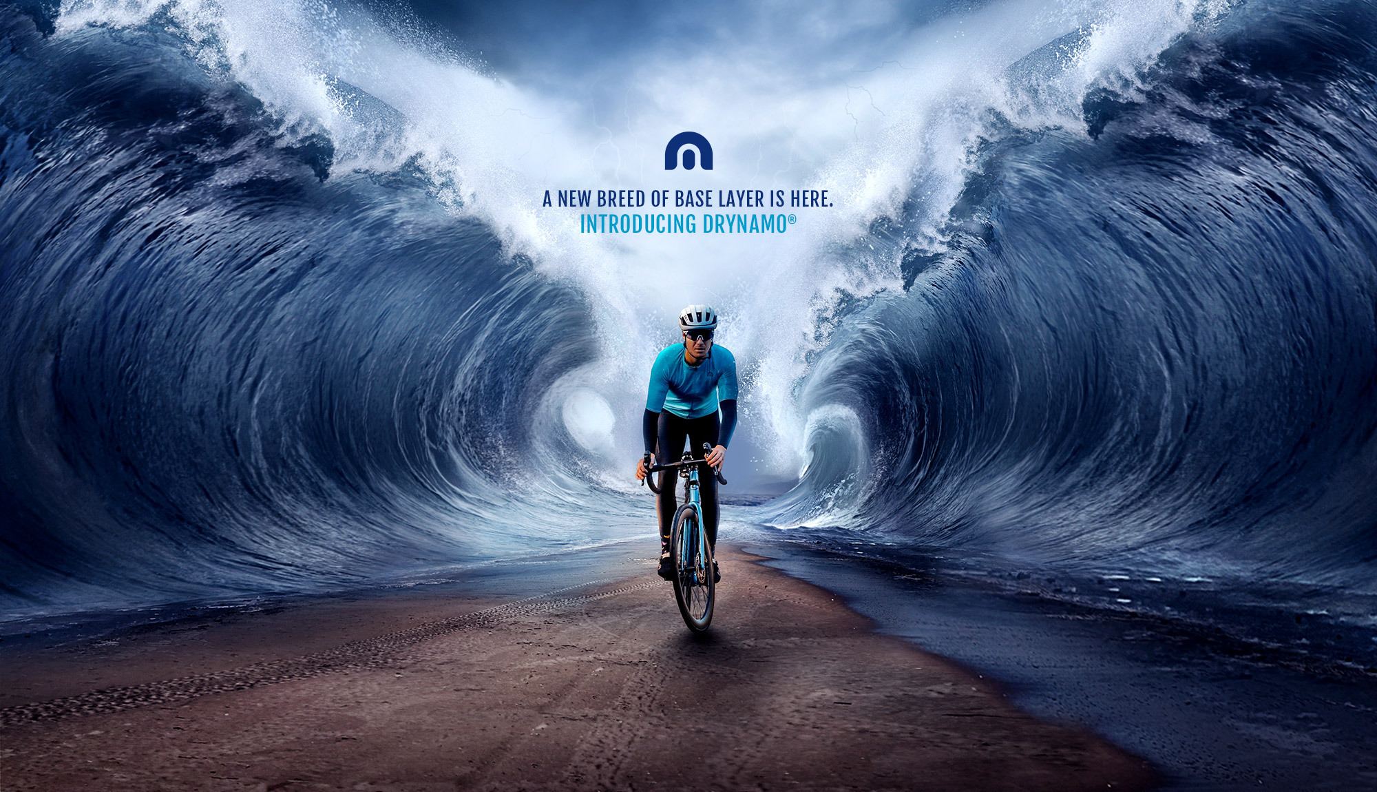
The campaign work earned global design awards, the photographs won numerous photography awards, and the brand has started to encroach into the mindshare of cyclists in America.

The work isn’t through, however. Season after season, as Megmeister introduces new products, there are photoshoots, videos, and lookbooks that need to be created. The Brand Leader team is ready and is constantly iterating on the look and feel of this brand, depending on the season, product, campaign, or cycling event.

It’s what Megmeister calls … Performance at the Core™.