
Stay Informed
Get the latest news, trends, and industry insights.
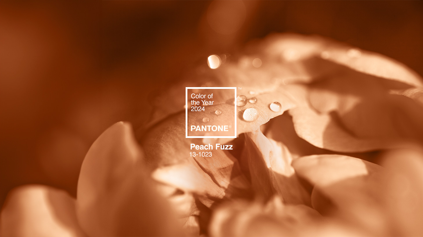
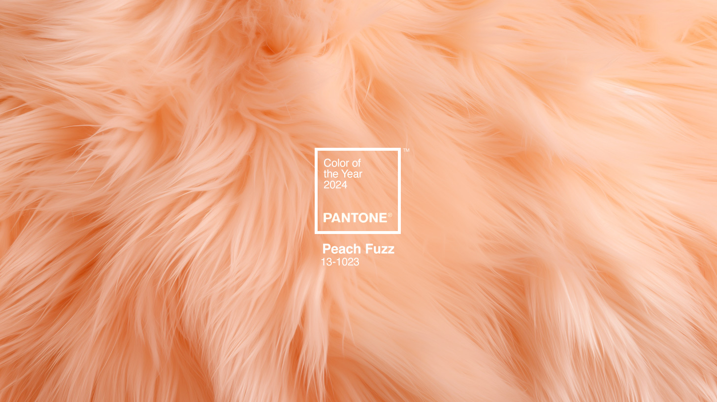
After only 30 days since the much-anticipated announcement of the 2024 Pantone Color of the Year, you’ve probably already seen the trendy color popping up across brands and products — like the Peachy Motorola Razr, Polaroid’s Peach Fuzz Instant Film, Movado’s Heritage Watches, or Ruggable’s collection of rugs, to name a few. PANTONE 13-1023 Peach Fuzz is already starting to make a splash across the fashion, beauty, interior design, and advertising industries, and we’re only in the first week of the new year. Don’t have your Peach Fuzz watch band or tumbler yet? Don’t worry; we’re just getting started, and Peach Fuzz has a lot more to offer in 2024.
But first things first. How on earth does Pantone choose the color of the year, and why Peach Fuzz for 2024? Well, let’s start from the beginning.
Pantone’s Colorful Legacy
In the early 1960s, Pantone was a printing company in the northern part of New Jersey, with a specialty in color charts for the fashion, cosmetics, and medical industries. Back then, every printer used its own unique color guide. Printers would create their own version of a color and then print each color differently depending on how they interpreted it. In addition, the communication between designers, ad agencies, and printers was difficult, creating a slew of color mistakes, inefficiencies, and reprints. Pantone knew there had to be a better way to do things.
This is where Pantone’s color-matching system came in. The tool organized color standards through a proprietary numbering system and chip format to match and identify colors quickly. It was introduced by the Pantone Color Institute to standardize colors so brands could have color consistency across all their designs and marketing materials. This set up Pantone’s rise to the leader in color.
Over time, Pantone became more than just a color-matching system. They became a global design force and a trusted trendspotter, setting the tone for design and style trends. In 1999, they announced the very first Pantone Color of the Year, which has now become a pillar of global society. Using trend analysis, the Pantone team translates what’s happening in the world into the language of color. The team of experts examines movies, art, fashion, design, travel destinations, and more to determine which colors currently have the most influence on the world.
The color-attuned team works to select a color that captures the imagination of designers, brands, and consumers, giving voice to thoughts and ideas otherwise left unspoken. Their extensive research narrows down their options to a singular color meant to set the tone for the coming year.
The Color of the Year
This year marks the 25th year of the Pantone Color of the Year program. With the selection of Peach Fuzz, we celebrate the fundamental role color plays in the human experience. Like in years past, this color is set to influence product development and consumer purchase decisions across the globe.
At a time when global tensions are high, between tumultuous wars and an election year, the selection of PANTONE 13-1023 as the color of the year serves as a reminder of everyone’s core desire for community and connection. Peach Fuzz is meant to draw us back together. Its warm, gentle hue reminds us of some of the things that are important — comfort, compassion, and kindness. Its vintage vibe and contemporary feel remind us of simpler times, making a nod to the past and present all at once.
“We chose a color radiant with warmth and modern elegance,” stated Leatrice Eiseman, the Executive Director of the Pantone Color Institute. “[It’s] a shade that resonates with compassion, offers a tactile embrace, and effortlessly bridges the youthful with the timeless.”
Pantone’s hope is that this color will stir up a sense of community and belonging, creating opportunities for individuals to engage and connect. Pantone is inviting us to create meaningful moments together.
The Power of Your Brand's Color
What does all this mean for your brand? Should you use PANTONE 13-1023 in your brand? Well, the answer is complicated. For some brands, yes. Apparel, fashion, cosmetic, and electronic brands could utilize the color with their products to stay current on the year’s trends. For other brands, no. Remember, it’s trendy this year but won’t always be. Service industry brands may actually dilute their brand equity by changing colors every year to follow the trends.
But there’s one huge takeaway that any brand can learn from Pantone. It’s simply this:
Color creates emotion, and that emotion is the building block of brand connection. PANTONE 13-1023 was specifically chosen this year to remind us of comfort, warmth, and kindness and to create a desire for community and connection. And, if you’re wondering if color can do all that, the answer is absolutely.
Colors have a strong influence on our minds, our feelings, our ideas, the way we perceive things, and, hence, how we respond to the world around us. It’s a universal language that tells a story, carries meaning, and evokes emotions without ever saying a word.
When crafting a brand’s visual identity, color is one of the most powerful and reliable ways to build emotional connections with your target audience. And because our emotions directly influence our behavior, they can have a measurable influence on consumers’ recognition and connection to your brand and even their purchasing decisions. In fact, studies show that 85% of customers identify color as a primary reason for choosing one brand over another.
When crafting your brand’s color palette, follow these guidelines, which is how we do it when we're creating, reimagining, or rebranding businesses.
Stand Out: Choose a color that differentiates your brand from the competition.
If you want to stand out, you can’t look like everyone else. Doing a visual analysis of your competitors will help reveal their color palettes and open up opportunities for you to find an “ownable” color that sets you apart.
Stay True to Yourself: Choose a palette that embodies your brand archetype/personality.
Knowing who you are first is key to determining the elements of your visual identity (type, image style, and color). Once you’ve determined your brand’s personality and characteristics, be sure to match your colors with those personality traits. For example, bright, bold colors evoke energy and enthusiasm, while more subdued colors create a soft, tranquil feel. Remember, your colors should send a message to your audience, even if there are no words to verbally communicate it.
Appeal to Your Target Market: Choose a palette that resonates with your target audience.
Different people have different color perceptions and preferences. Think about your ideal customer and match colors to that person’s preferences, personality, and identity. However, be sure to remember point number one: Stand out. A lot of competitors within your industry will choose similar colors because they convey the right message and appeal to their consumers. Think of the healthcare space. Over 80% of healthcare brands choose calming and soothing colors like blues and greens. So, how do you stand out and appeal to your audience? That’s where accent colors and different color hues come into play. Try to identify hues and secondary colors that help differentiate your visual identity.
Don’t overlook your brand’s color. It’s one of the most important aspects of your visual identity, and boy, does it pack a punch. Pantone’s Color of the Year is a prime example of that. So the next time you spot that Peach Fuzz product in your home (yes, I bet you’ll have something before the year ends), think about how you can use color to build deeper connections between you and your consumers, and if you need help with that, let us know.
Stay Informed

